I’ve created a series of short movies about my transition to KRITA from Photoshop. Krita is free, and like Photoshop has an animation timeline built in. Krita’s animation features are much stronger than Photoshops, so if you’re looking to liberate yourself from a monthly subscription fee, this might be a good option. I’ll be doing a regular series of movies about my use of Krita for design and animation on my youtube channel and my patreon.
PHOTOSHOP TO KRITA
These seven movies cover issues that arise when moving from Photoshop to Krita:
 |
KVP1: ANIMATION
An overview of the differences between Photoshop and Krita, and the advantages that Krita has over PS – features a quick demo of how to create animation key drawings and inbetween them.
|
 |
KVP2: MASKS
The best way to color characters is to use masks – photoshop has layer masks and clipping masks, but happily, Krita has an equally easy to use method.
|
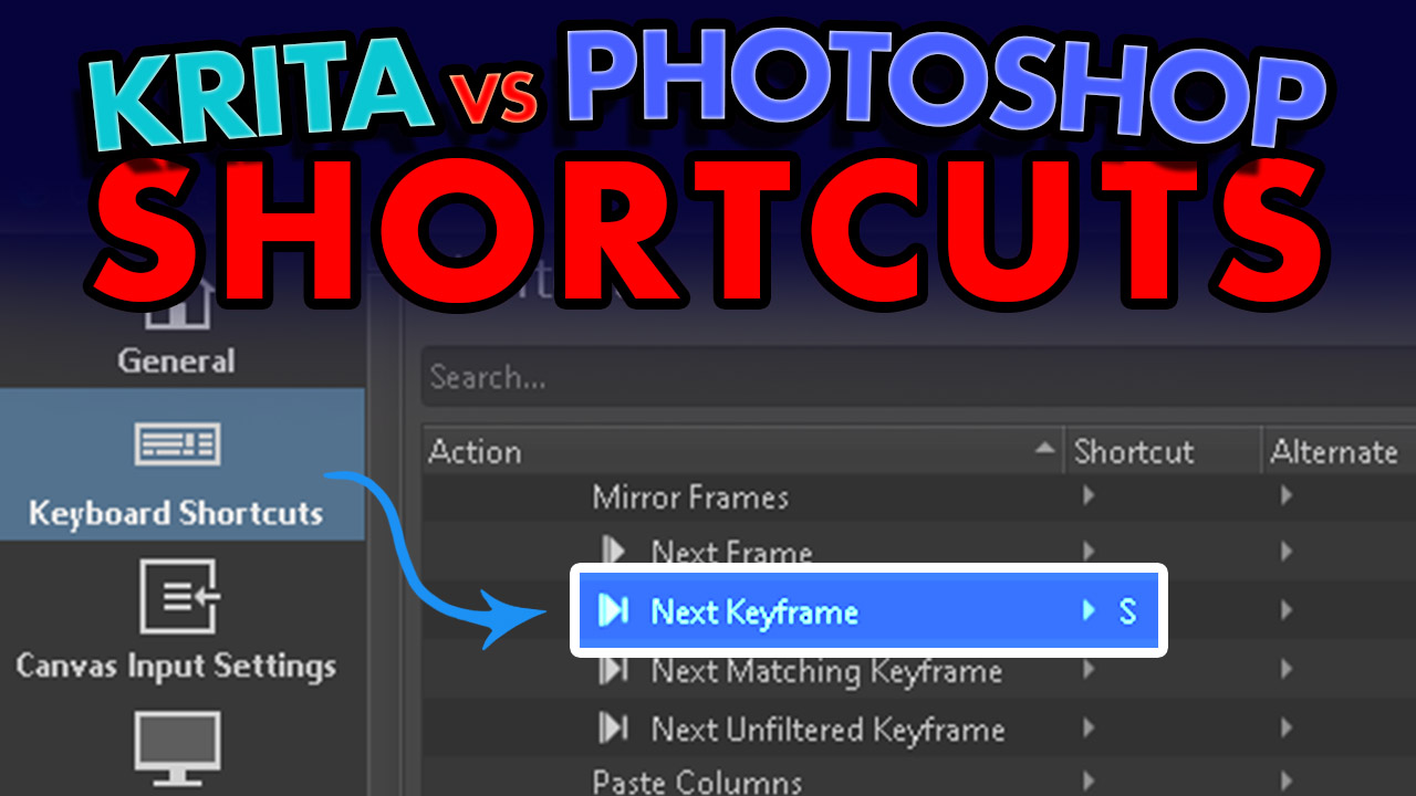 |
KVP3: HOTKEYS
A barrier to transitioning from PS to K is muscle memory – and as so much of that is based on shortcuts / hotkeys, it’s vital to map the ones you’re familiar with onto the equivalent tool in K.
|
 |
KVP4: TABS VS WINDOWS
My first experience with tabs in Krita was a bit scary, as I like floating windows – took me a while to figure out the trick of making Krita’s tabs float as they do in PS – it’s actually very easy once you know how.
|
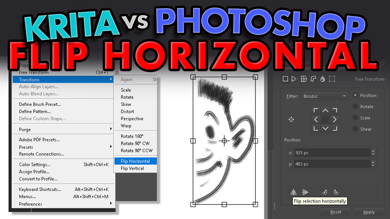 |
KVP5: FLIP HORIZONTAL
The ability to temporarily flip an image horizontally is an old design trick, as the temporary mirror image allows you to see the drawing fresh for a couple of seconds. Krita has a different way of doing this than Photoshop (ALT/OPT & M), and I prefer it.
|
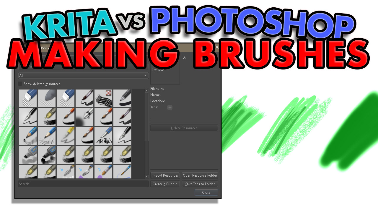 |
KVP6: BRUSHES
A good idea when learning a new drawing or design program is allowing time to find brushes that you like. Krita’s brush system is very customisable. It did take me a while to get used to it, but I’ve found some brushes that I really enjoy using.
|
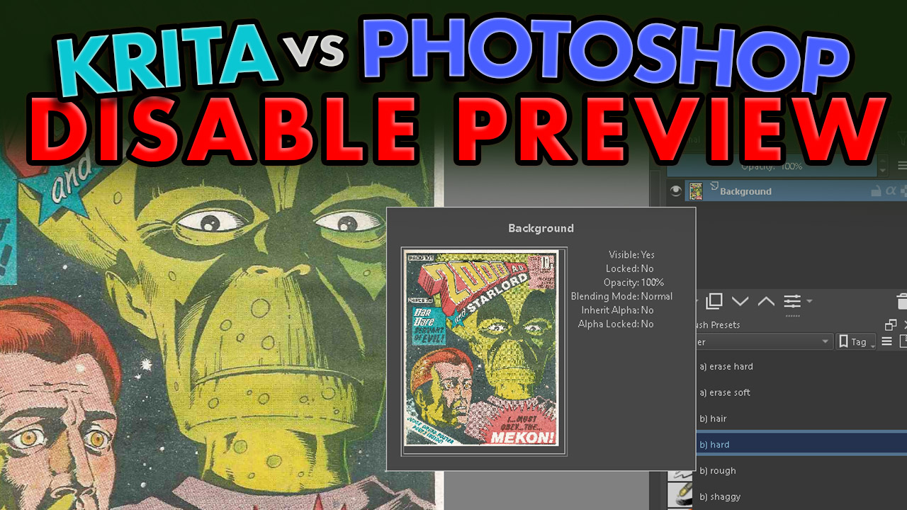 |
KVP7: LAYER PREVIEW
An irritating behaviour that got on my nerves = the layer preview pop out. Here you’ll find out how to nuke it.
|
ANIMATE IN KRITA
These eight movies cover first steps in animating in Krita (applicable to animating in general):
 |
ANIMATE 1: TIMING & SPACING
A vertical bouncing ball animated by hand, using timing charts to control the inbetweens.
|
 |
ANIMATE 2: SQUASH & STRETCH
Squash and stretch is added to improve the animation. Some digital manipulation is used to speed things up.
|
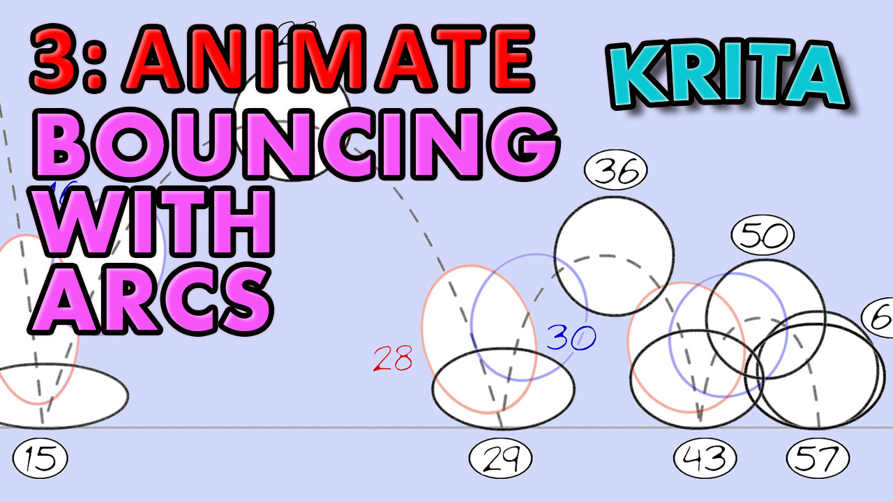 |
ANIMATE 3: ARCS
Horizontal motion is added to create the classic bouncing ball animation.
|
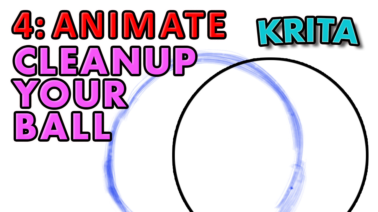 |
ANIMATE 4: CLEANUP
Cleaning up the rough line: the correct process is shown, as there’s a right way and a wrong way.
|
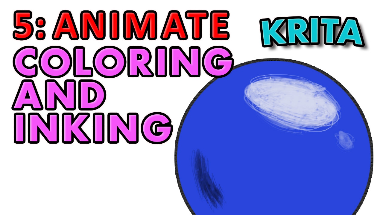 |
ANIMATE 5: COLOUR & INKING
Using masks (alpha layers) to create a boundary for the colour and the ink lines.
|
 |
ANIMATE 6: IMPORT AUDIO
Krita’s audio is very basic, but it beats Photoshop hands down, as PS has none. The latest Krita version (5.2) has improved audio, in that it’ll play in sync more reliably, and in mp3 as well as wav. Should you animate a dialog scene, this is essential.
|
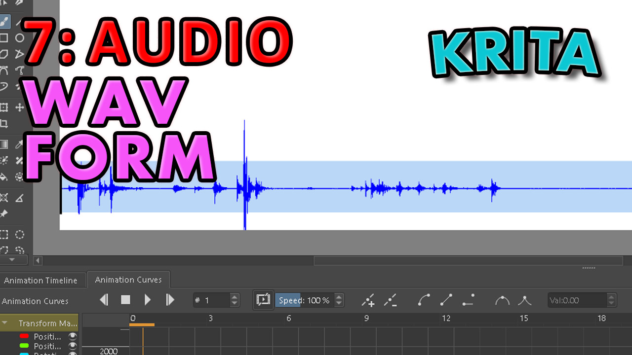 |
ANIMATE 7: MAKE A WAV FORM IN KRITA
One defect in Krita (currently) is that it doesn’t allow the display of a wav form. Following a suggestion in a reddit thread, I created one manually. Not going to lie: it’s a bit of a pain, but very doable if you absolutely need one.
|
 |
ANIMATE 8: DRAW WITH THE RIGHT BRUSH
By this time I had grown very used to a few brushes, and started to draw some classic cartoon character designs, in the generic 1960s/70s/80s Disney / Bluth style. This movie shows the creation of one of these from rough through colour.
|
For more of my courses there’s a masterlist of classes, covering traditional principles as well as how to animate in Photoshop, Flash-AnimateCC, Harmony and After Effects. For new movies,
subscribe to my youtube channel and check out my patreon!

