Movies in my LYNDA/LINKEDIN-LEARNING ‘Tips & Tricks’ series covering timing, spacing & easing, assembled into a virtual course. BTW, check out my patreon, there’s going to be a lot of animation resources posted there!
 |
1: TIMING & SPACING BASIC
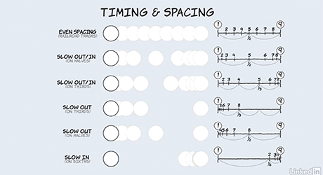
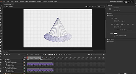
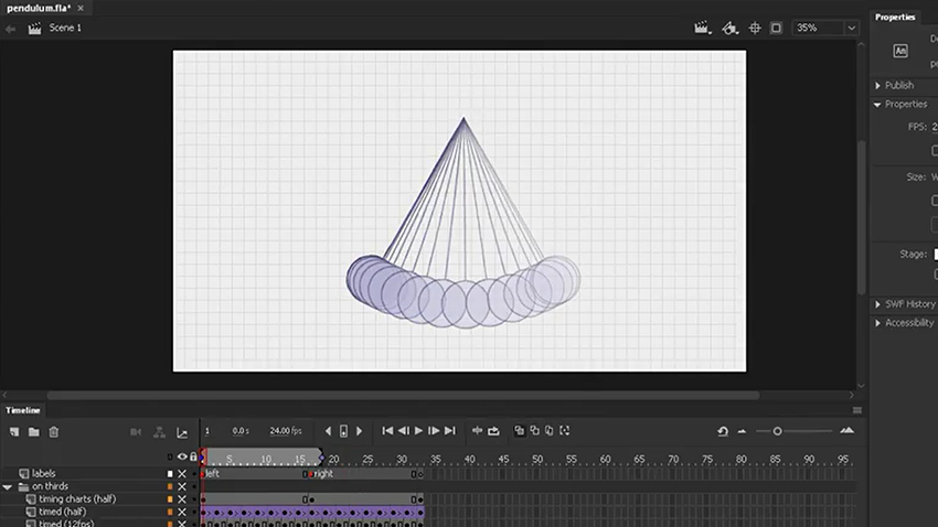
Timing and spacing are not the same thing! By changing the timing charts or tween settings a very different spacing is created – which can affect the material properties of the object or character. (Of course you can change the spacing by moving the keys further apart on the screen).
|
 |
2: TIMING CHARTS
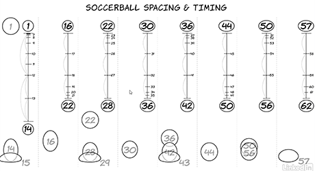
Timing charts allow the animator to control the creating of the breakdowns and inbetweens.
|
 |
3: TIMING ADVANCED
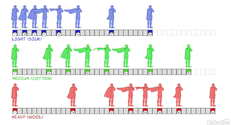
The same key animation of a fluttering cape with different timings.
|
 |
4: TEXTURE
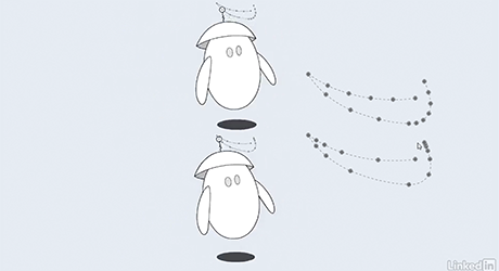
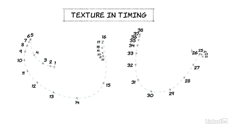
Good animation allows different parts of the body to move at different speeds, so that we don’t have ‘mushy’ timing.
|
 |
5: TEXTURE ADVANCED
A deeper look at texture.
|
 |
6: ANIMATING WALKS ON BEATS
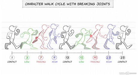
A great way to plan walks, jogs and runs is to animate them on a fixed beat, i.e., one contact pose every 12 frames for a standard walk, etc.
|
 |
7: ONES, TWOS & THREES
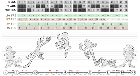
When animating by hand, it’s particularly crucial to understand the difference between frame rates, and whether to hold a drawing for two or three frames, as this equates a huge increase or reduction in the drawings required.
|
 |
8: MAKING POSES READ
Inspired by a comment in Eric Goldberg’s book, how few frames do you need for a pose to ‘read’.
|
 |
9: MAKING EXPRESSIONS READ
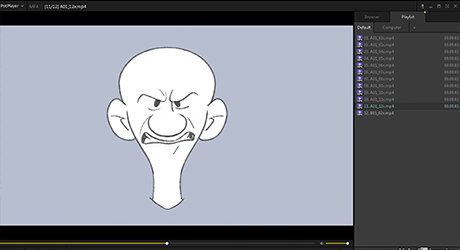
Inspired by a comment in Eric Goldberg’s book, how few frames do you need for an expression to ‘read’.
|
 |
10: COLOR vs. PENCIL TEST
When I worked for Don Bluth, an animator mentioned that pencil tests feel faster than the final coloured scene – so I did a short movie to show the difference – I’m not sure I can tell the difference.
|
 |
11: CHARTS vs. TWEENING
One thing that makes modern animation feel different from traditional is that modern animation tends to use digital tweening, which animates the tweens in a very naturalistic way – very unlike the old hand drawn inbetweens, which were on halves or thirds.
|
 |
12: FORESHORTENING
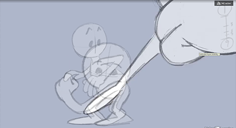
Zipping off screen can be tricky – a quick example.
|
 |
13: POPPING ON AND OFF SCREEN
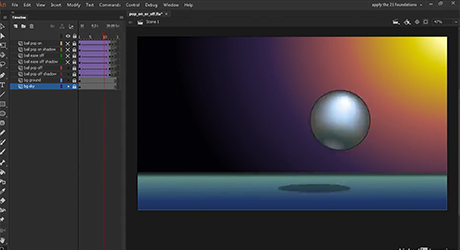
When exiting the screen, it’s important to allow a frame or two where it’s clear that the object is exiting the shot – it’s very easy to have the object or character ‘pop’ off, which would be bad.
|
For more courses there’s a masterlist of classes, covering traditional principles as well as how to animate in Photoshop, Flash-AnimateCC, Harmony and After Effects. For new movies dealing with the free design/animation app KRITA, subscribe to my youtube channel and check out my patreon!
