 |
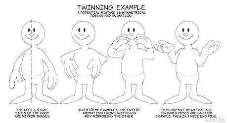
1: TWINNING
A no-no (in the world of Disney/Bluth/WB style of animation is ‘Twinning’ – when a character’s limbs mirror one another in action and timing. There are styles in which this is OK (many TV shows are fine with it), but if you aspire to feature quality animation, it’s best to avoid. More: Loosen the Joints, and Loosen the Body.
|
 |
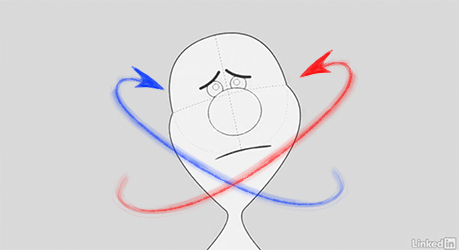
2: HEAD ROTATION
It’s easy to slip into a static up/down animation when moving the head – but remember that the skull can rotate freely, it’s gimbaled. By tilting the head left to right, and forward / back, we can achieve a much richer range of motion. Avoid a static or mechanical updown pattern!
|
 |
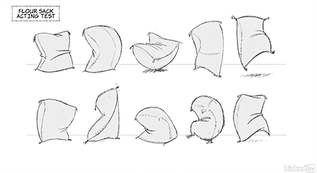
3: FLOUR SACK
A classic test invented by the early Disney animators was the flour sack test. An animator should be able to convey the emotion or action of a character without the need of drawing a face or even limbs. A good example of a character entirely animated in this style is the magic carpet in ‘Aladdin’.
|
 |
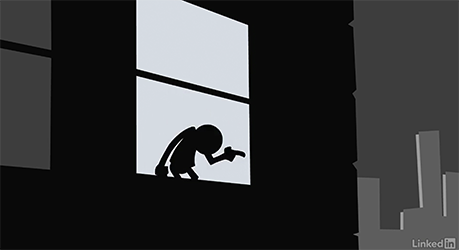
4: PANTOMIME
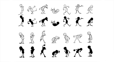
Building on the same principle as the flour sack, it should be possible to ‘read’ the emotional tone of a character as well as their actions from their silhouette alone.
Clear positive and negative shapes as well as lines of action are required to make this happen. Avoid fiddly designs!
|
 |
5: SILHOUETTE
This movie continues with the examples in movie 4. Examples of quick gesture drawings are shown along with their silhouette versions. Each pose is readable even in black outline alone. If the pose doesn’t read, it should probably be redrawn. This is more important for keys/extremes, less so for inbetweens.
|
 |
6: HEAD TURNS & EXPRESSION
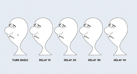
An easy-to-make mistake when changing a character’s expression is to make the change happen during a head turn. Richard Williams described a better method, in which the change happens only after the character’s head turn has been completed, or nears completion, allowing the change to ‘read’.
|
 |
7: PERSPECTIVE INTRODUCTION
It’s essential to understand at least the basic principles of perspective, with a focus on the horizon/eye-line, as this determines the correct placement of your character in the scene.
Different perspectives (birdseye, wormseye, 1/3) produce drastically different scenes.
|
 |
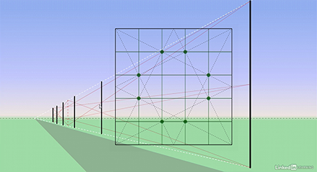
8: PERSPECTIVE SPACING
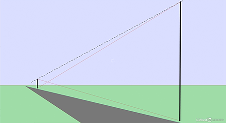
The technique in this movie can be used purely as a drawing aid – the classic example here is the correct placement of lamp-posts. However, this also applies to the position of animated characters or objects, as it allows you to determine how quickly they approach the camera.
|
 |
9: PERSPECTIVE THIRDS
This is the kind of trick you might never need – but if you do need to subdivide spaces in thirds or fifths (as opposed to halves as in movie 8) then it will be very useful.
|
 |
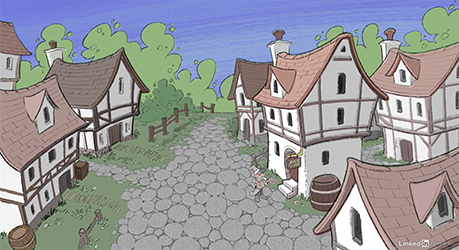
10: STAGING
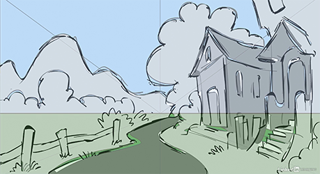
This was a fun movie as it allowed me to draw an elaborate medieval scene in different angles. Different angles are essential for different kinds of shot – so for example, a downshot (birdseye) view makes a great establishing shot, a 1/3 eye level is better for dialog scenes, and so on.
|
 |
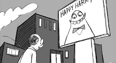
11: STAGING (ADVANCED)
The position of the camera can be used to convey story information – the relationship between characters or between the characters and the environment. Choosing the right camera angle or staging is an important skill, especially if you’re looking at storyboarding as a career path.
|
 |
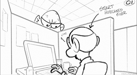
12: LAYOUT POSES
One step in the production process that can really help to lock down the quality is the layour department. It’s possible to go directly from rough boards to animation of course, but strong layouts can add several extra poses for the animators to work with, giving them more confidence in their work.
|
 |
13: LINE OF ACTION
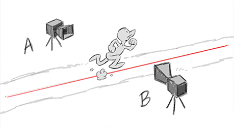
An imaginary line between two characters is called the ‘line of action’ (or sometimes the ‘line of the camera’).
It’s not a law that you can’t cross the line – but 99.99% of the time, pick a side and stick to it, or the result will be confusion for the audience.
|
 |
14: LIGHTING
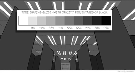
A great challenge to set yourself is to take a line drawing of a scene and to ‘light’ it with 3 or 4 tones, no more.
It’s incredible what you can achieve with so few tones – and the same line drawing can be given two very different atmospheres – all good stuff in storytelling. I strongly recommend this as an exercise.
|
 |
15: COLOR
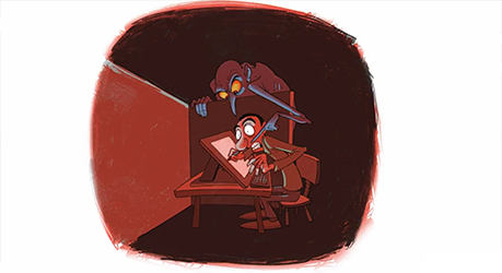
In addition to tone, color can be used to convey the emotional content of a scene or image. Don’t be afraid to experiment, or to push the color in your shots – as most of us are working digitally now, it’s easier than ever to try bold color combinations.
|
 |
16: ACTING WITH CLOTHES AND HAIR
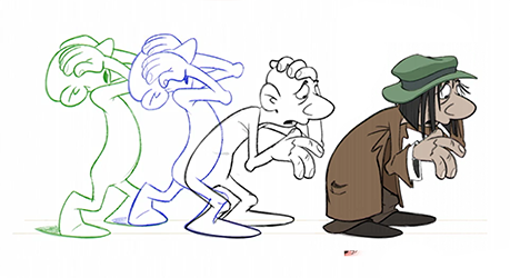
Every part of an animated character can ‘act’ – so if a character is sad or downtrodden, their hair, hat, coat, etcl, can also look sad or downtrodden. Remember that in animation from the 1920s and 30s, often even the blades of grass were ‘alive’!
|
 |
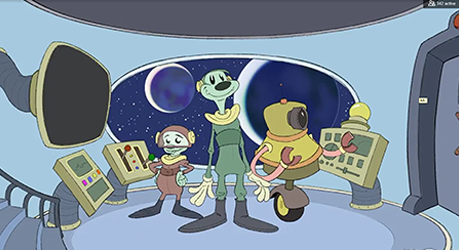
17: DON’T POP! 1: LINE & COLOR
The bane of many artists (after being told to “have fun with it”) is to be asked “make it POP”. A meaningless shibboleth that tells you nothing beyond the fact that the client doesn’t know what they want, but that they don’t like what they see. This movie shows that concrete language can and should be used instead of buzzwords.
|
 |
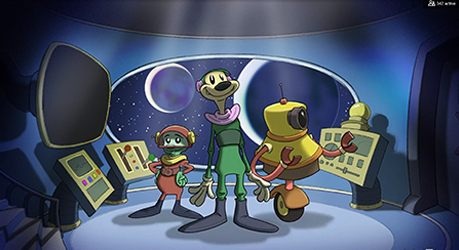
18: DON’T POP! 2: LIGHTING
Taking the original image, we begin to ‘make it pop’ – by adding lighting. A dramatic toplight with dark shadow areas transforms characters and background, and adds the impression of air. But our imaginary client is hard to please. I’m afraid even this won’t be enough. They still don’t think the image quite ‘pops’. UGH.
|
 |
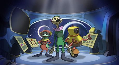
19: DON’T POP! 3: CAMERA
We continue to improve the image – but first by taking the path of least resistance. In this case, I carefully moving the existing layers and tweaked the background to create a slightly more dramatic perspective. The image is a bit better, but it’s clearly derived from the original. Hopefully the client will be happy with this.
|
 |
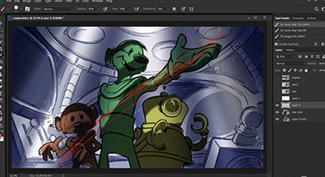
20: DON’T POP! 4: COMPOSITION
But disaster, the client still hates it. Then, we redraw. In this case a completely new image and composition. Ironically, this more impressive image is easier to draw as it’s an upshot, and doesn’t need so much focus on background elements!
|
