 |
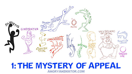
1: THE MYSTERY OF APPEAL
One of the most frustrating aspects of design (or any creative field) is that many times a crude work without little or no technical skill ‘goes viral’. It finds an audience, apparently without effort, while most artists labour to master technical skills, but without the popularity! This doesn’t mean we give up on the technical aspects however…
|
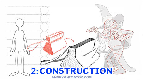 |
2: CONSTRUCTION
If you want to draw in the classic / traditional style – e.g., the works of Disney, Bluth, WB or Richard Williams, then you’ll have to understand the construction process: how we use very simple primitive forms as a base on which we draw the final artwork.
|
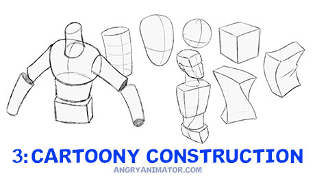 |
3: CARTOONY CONSTRUCTION
More examples of construction, but also demonstrating how we can twist and squash the primitive forms to create interesting and dynamic poses. Cubes, cylinders and spheres are the primary building blocks – these are almost always enough to give us the illusion of form.
|
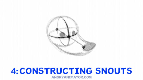 |
4: CONSTRUCTING SNOUTS
A short but useful design method for determining the point of a long snout or a beak. This simple method will allow you to design the face without the point of the snout or beak sliding around. Mice and birds are particularly in need of this construction trick.
|
 |
5: DIMENSIONAL FORMS
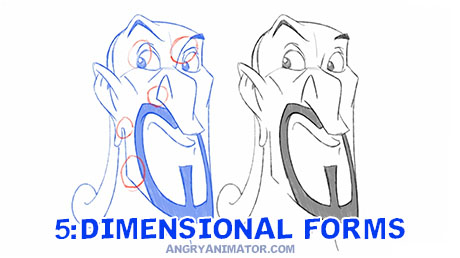
A really simple trick if you want to avoid the flat, TV puppet look: instead of closing off lines, leave them open, so the colour flows from one area to another. This creates the illusion of a continuous organic form instead of a hard, closed off and flat color separation.
|
 |
6: OBJECT DESIGN
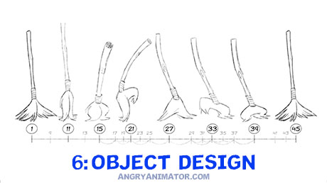
The principles of design that we use on an organic character are applied universally, even to objects that are usually inanimate. There is no difference in the way we apply the construction method to a magic broomstick – it may be a simpler shape, but the process is much the same.
|
 |
7: ANIMATING OBJECTS
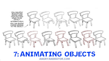
More examples of inanimate object design, with the simple forms animated in a classical style to demonstrate the principles in motion and not simply in a static pose.
|
 |
8: FROM ROUGH TO CLEANUP
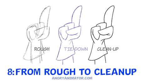
A common mistake made by students and beginners is to draw their first version too cleanly. It’s often best to draw in stages: your first pass is a rough/gesture drawing, done in less than a minute, then it is tied down more carefully, and if necessary, cleaned up for coloring.
|
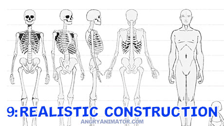 |
9: REALISTIC CONSTRUCTION
The method of constructing cartoon characters on top of very basic forms like cubes, cylinders and spheres is also used when drawing realistic characters in normal human proportions. The geometrical shapes can still be reduced to these very basic volumes.
|
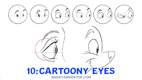 |
10: CARTOONY EYES
Eyes are often regarded as the most difficult to master as they are so subtle. Even so there are tricks that can be used to make them seem like living volumes, and not flat lifeless colour areas. Definitely not easy, but not impossible either.
|
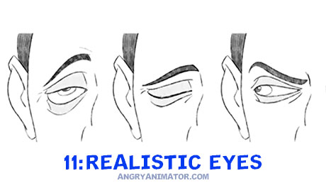 |
11: REALISTIC EYES
I took the slides from the previous course ‘Drawing Cartoon characters for Animation’ and inbetweened them, to see how well the images move when the motion is propertly smoothed out. A nice way of testing the drawings, as this can often expose weaknesses in structure or volumes.
|
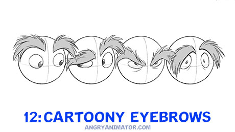 |
12: CARTOONY EYEBROWS
Anyone familiar with 1960s era Disney or the Don Bluth movies will recognise this style of eyebrow. Great fun for the animators to draw, but an absolute headache for the assistants and inbetweeners who have to plot out the many points and tufts on a gazillion inbetweens.
|
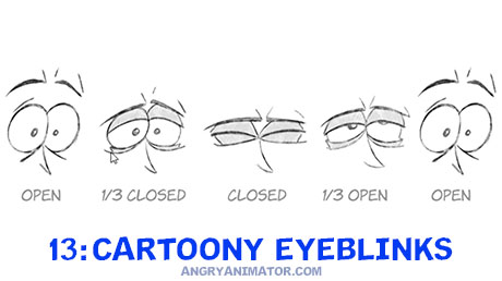 |
13: CARTOONY EYEBLINKS
This kind of eyeblink used to give me headaches when inbetweening it. It can be easy enough to draw the wide open and closed shapes, but sometimes the tween poses can make you see optical illusions! Hopefull this chart will help with the puzzle.
|
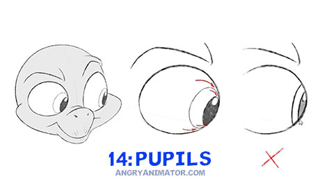 |
14: PUPILS
A common problem is the appearance of ‘flat pupils’, especially on inbetween drawings or frames. This movie shows a nice method which will force the pupil into keeping a rounder, more natural form.
|
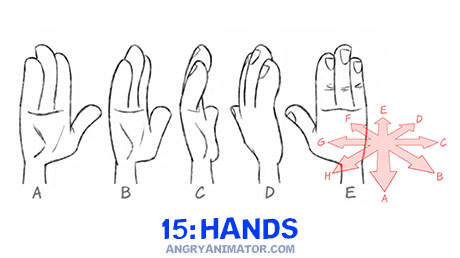 |
15: HANDS
I became so tired when hand poses became hard to find in puppet animation programs in Flash or AnimateCC / Harmony that I created a simple naming system, allowing my ever expanding library of hand shapes to be sorted logically.
|
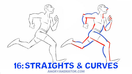 |
16: STRAIGHTS & CURVES
The secret to the creation of 1960s/70s Disney or 1980s early Bluth drawings is the mastery of straights vs. curves. It reached an apex in that period, expecially on ‘Secret of NIMH’, ‘Jungle Book’ and the Dragon’s Lair game. It can still be used to create strong designs.
|
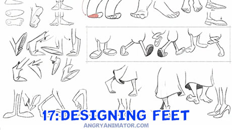 |
17: DESIGNING FEET
A deceptively complex shape to draw well, in this movie I reduce the food to a series of simple pyramidal shapes, with several variations from cartoony to realistic/anatomical.
|
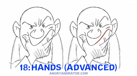 |
18: HANDS (ADVANCED)
A challenging problem: how to make a hand touch a face, and feel like it’s actually making contact. It’s not as easy as it sounds! This movie gives a few examples, with rules of thumb for achieving a design that’s strong but also readable.
|
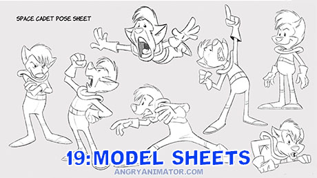 |
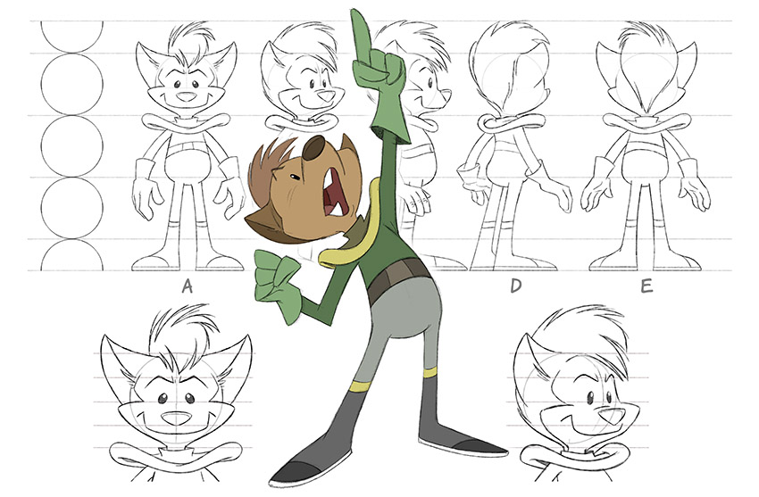
19: MODEL SHEETS
Overview of model sheets (in which the character is show from different angle, to stay ‘on model’) as well as pose sheets, which show the character in more extreme or dramatic acting or action poses.
|
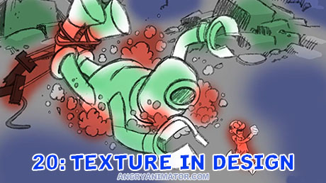 |
20: TEXTURE IN DESIGN
Avoid having the same level of detail across an entire image – the eye becomes tired of the sameness. Whether in a character design, a background layout, or even the timing of the animation, texture (areas of higher and lower density of detail) are crucial.
|
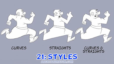 |
21: STYLES
Though my go-to style is the classic Bluth/Disney/WB look, all the principles are universal and can be applied to very different productions. You can apply the different principles or fules of thumb as needed.
|


This is awesome