A personal hobby-horse is the UI design fad (and it is a fad) of monochrome icons / UI design. It’s got to stop. I know this article has close-to-zero chance of influencing anyone, but hey, misery loves company.
Though the plague infects almost all software now, it wasn’t always the case. Take Flash (the program that would be bought by Adobe and ultimately renamed AnimateCC. Here’s the final Macromedia version (2005). Note the very simple use of colours in the toolbar:
As far as I can tell, Adobe’s UI style has always been monochrome. Here’s the Photoshop toolbar in versions 1.0 and 3.0. Remember at this time, the Macs were in B&W, so the UI designers had no choice. Nevertheless the toolbar is very crisp. You’d never have a problem finding the tool needed, because each shape is sufficiently distinct from those surrounding it. When two shapes are similar (pencil and brush) they’re on different rows, NOT adjacent. Note the diagonal line and the dropper tool, both of which are the same basic shape. One tilts right to left, the other left to right, again to distinguish them.
In 2007, Adobe bought Flash and named it version CS3. To fit with the historical accident of monochrome Adobe UI design, the Flash toolbar went monochrome:

The Flash UI then dispensed with another great design feature, tone. Notice how all the panels begin to bleed into one another in CS5.5 (2011):
And then comes (shudder) the switch to dark UI. Another fad which has spread like a plague to all UI design, not just Adobe’s. Sure, they let you toggle back to light if you like, but this is their preferred look. This is such a superb design that panels now begin to bleed into one another so that you can’t tell where one ends the other begins, as the bars containing the titles ‘publish’, ‘properties’, ‘swf history’, etc., all have the same tonal value as the field below them. All of which adds up to a small but significant amount of time to find the desired icon / field.
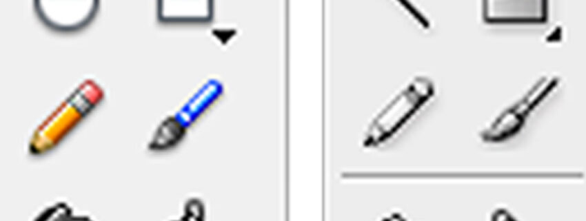
To illustrate the simple principle, here are the toolbars from the final Macromedia version next to the first Adobe version following and a much later version, 5x. Notice how similar many of the shapes are. I would criticise the Macromedia designers for not using MORE colour (e.g., to differentiate between the fill tools for shapes and lines, which are far too similar to be easily identified).
This is particularly egregious – as the fill tool is to color lines and the other is to colour areas (so surely keeping the line fill icon black and the area fill icon colourful would have been a logical choice). Not to mention making the two icons graphically different in a meaningful way to that there is no mistake when selecting them:
The position of two similar shapes (pencil & brush) on the same row isn’t such a disaster in colour, but when we degrade the UI to B&W, and place both pencil and brush on one row, confusion ensues. (I realise we can now stack the toolbar as one column, a feature I detest, as I hate to scan a very tall pillar of increasingly cryptic monochrome icons). Note to designers: if I have to wait for the ‘smartip’ to explain your icon in TEXT, then YOU HAVE FAILED.
A closer look at the pen and brush icons. Both are diagonal, near identical silhouettes. By stripping colour from the interface, 100% of the brain’s pattern recognition goes to the form. But colour is the quickest shortcut, the thing our brains is wired to see first. The icon on the left looks like a pencil, the one on the right might be a rocket, I don’t know. When I use the final Macromedia version, my hand chooses the correct 100% of the time as my mind can shortcut to “blue = brush” and “orange = pencil”. The choice on the right is as user-friendly as Sumerian cuneiform.
Oddly, on the later versions, Adobe allows color to appear on the icon when you rollover it with a mouse. Odd, as this doesn’t expedite the selection of the icon, it’s just a pretty picture on rollover. The default should be colour, as the red / green / blue colours make the content of the icon MUCH easier to interpret.
The monochrome / dark UI fad has spread, and is now used even by companies who compete with Adobe (like Toonboom’s Harmony) or even open source software like Krita. It’s a shame, because it’s a truly lousy template that leads to hard to parse interfaces.
A friend recently made me aware of Affinity as a potential replacement for some Adobe software – I haven’t used it yet, but it’s a lot cheaper than Adobe, you can buy it not rent it, and joy of joys, it uses color icons. What a difference! Notice how otherwise similar shapes in the horizontal menu bar are easily differentiated by careful use of colour.
Take a look at the toolbar! My brain understands exactly what the tools are. Note also that the shapes are given blue to logically cluster them as having a similar function. I don’t need a ‘smart-tip’ to grasp the functions here.
That’s about it. I know this has been a colossal waste of my time, but you never know. If you have input into UI design for some slick animation or design program, you might find your software being a lot more accessible to users, who will be able to build ‘muscle memory’ by the careful application of a little pigment.
Oh, and I’d also like to be able to tell where one panel ends and other begins. It’s really not asking a lot, is it Adobe?


