If you want to follow my full courses and don’t already have a subscription to linkedin learning, the link below will give you a free 30 day trial, more than enough time to watch the course (I get a small commission if you sign up here:) LinkedIn Learning: Start your 30 day free trial
I’ve compressed this essay into a 9-minute movie:
Here’s the rest of the overview with individual samples:
Most animators have encountered the ‘Twelve Principles of Animaton’, coined by Disney animators Frank Thomas and Ollie Johnston in their 1981 book ‘The Illusion of Life’:
| 1. Squash and Stretch 2. Anticipation 3. Staging 4. Straight Ahead/Pose to Pose 5. Follow Through / Overlap 6. Slow In and Slow Out |
7. Arcs 8. Secondary Action 9. Timing 10. Exaggeration 11. Solid drawing 12. Appeal |
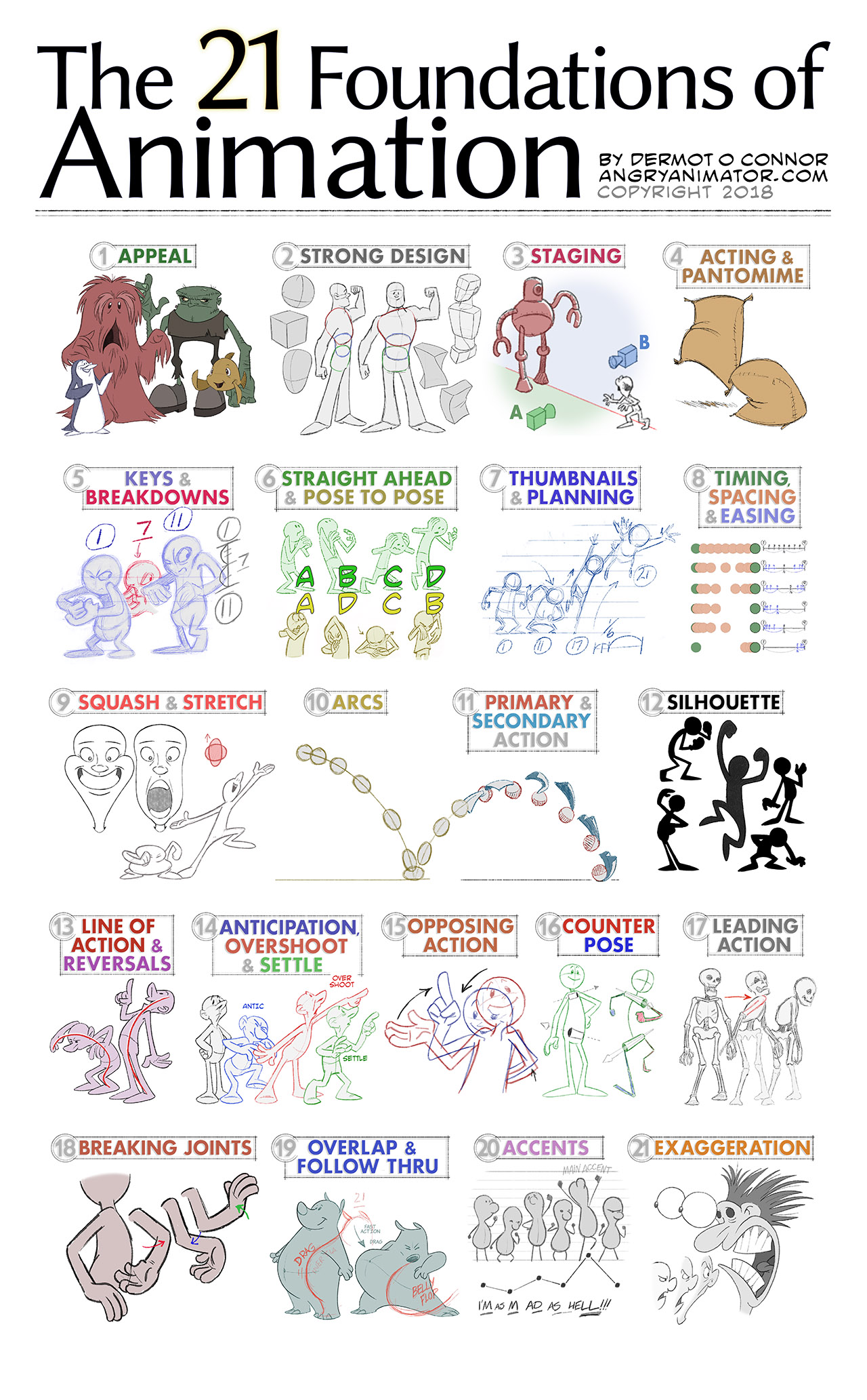
In the process of creating my tutorials for Lynda / Linkedin, I’ve felt it might help students if a few more principles were included in a more chronological order. I’ve therefore edited and expanded the list, and hope that you will find it useful. I’ve also titled my list the ‘Foundations’ of animation to reduce confusion.
UPDATE #1: Placing ‘Appeal‘ as #12 creates the impression that it is a natural consequence of mastering #1-11. This isn’t true. Many children have produced appealing drawings without any knowledge of technical principles, and many skilled works have no appeal. If you don’t have appeal, all the technical mastery in the world won’t save you.
UPDATE #2: The sequence is not ordered by priority. ‘Staging‘ is a more fundamental principle than ‘Squash & Stretch‘. I have re-ordered the list accordingly.
UPDATE #3: Frank and Ollie excluded a few principles. I’m adding them, in italics. I have tried to arrange them in order of logical priority. For example, #1 through #7 on my list can be used by any performer – they would be relevant to an actor or dancer. At the bottom of my list we find principles that determine more subtle aspects of animation (e.g., overlap/follow-through).
With all due respect to the masters, here is my updated list:
| 1. Appeal 2. Strong Design 3. Staging 4. Acting & Pantomime 5. Keys and Breakdowns 6. Straight Ahead / Pose to Pose 7. Thumbnails & Planning 8. Timing, Spacing & Easing 9. Squash and Stretch 10. Arcs 11. Primary & Secondary Action 12. Silhouette 13. Line of Action & Reversals 14. Anticipation, Overshoot & Settle 15. Opposing action 16. Counter-pose 17. Leading Actions 18. Breaking Joints 19. Overlap & Follow Through 20. Accents 21. Exaggeration (and ‘cartoon physics’) |
Let’s take a quick introduction to each foundation, with examples.

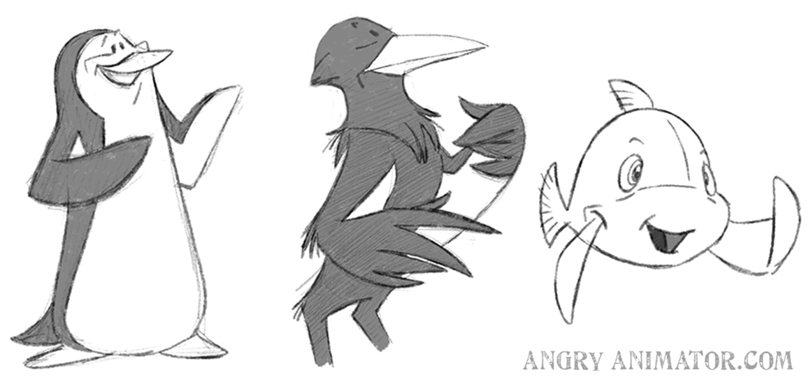
 Appeal does not merely mean ‘cute’ – though cute characters do tend to have instant appeal – especially those with large eyes or button eyes (making them a bit like teddy bears):
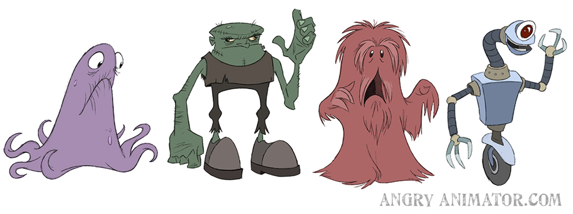
 Of course cute characters have appeal, but villains can also have appeal, and ugly or villainous characters can have appeal:
(Images from my Lynda / Linkedin course ‘Drawing Cartoon Characters’)
It may help to think of appeal as ‘charisma’, ‘interest, or ‘charm’.

 Characters are constructed out of basic forms like spheres, cylinders and boxes, with great care taken to make sure that the designs remain on-model throughout a production.
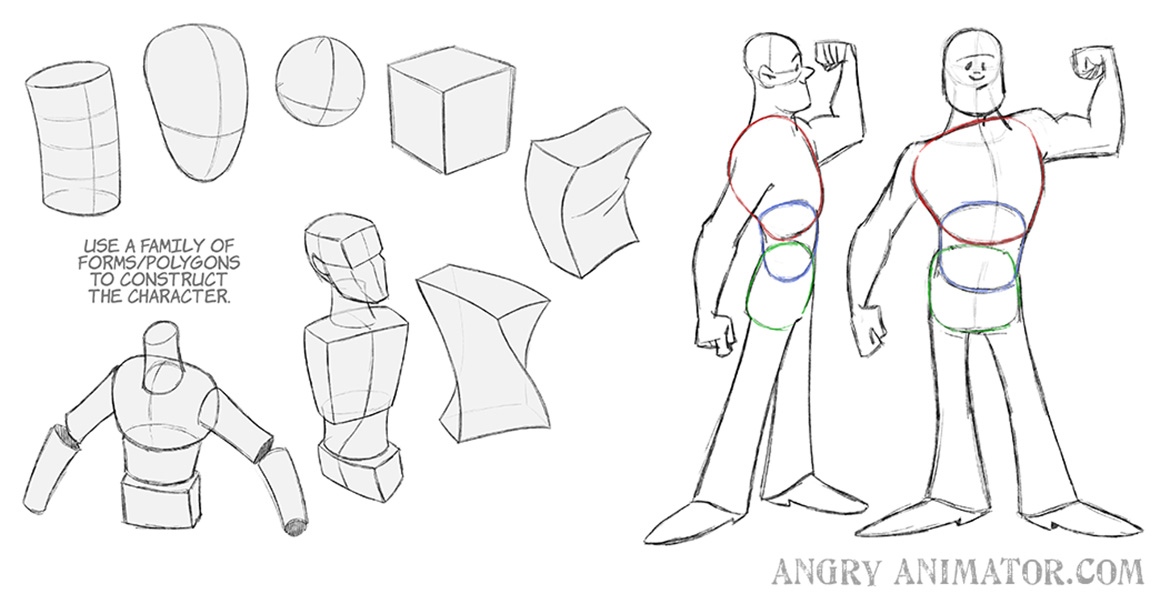 Model sheets dictate the correct proportions and designs of characters.
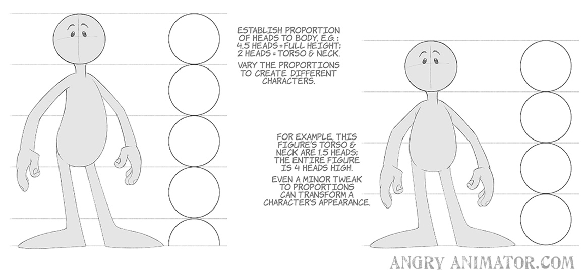
(Images from my Lynda / Linkedin course ‘Drawing Cartoon Characters’)


Incorrect placement of characters and camera results in a banal shot, boring to animate and boring to watch. Correct staging communicates character and story elements, and is visually interesting. In the right panel, we see that the small character is having a very hard time convincing his friends; in the left panel it is not obvious what is happening.
The power dynamic between employee and boss is much clearer in panel 2, below:
Different placements of the camera can produce radically different shots. One common technique is to draw an imaginary line between the characters, and to stage the sequence on one side of that line. In the illustration below, there are two possible sides, A and B. To be consistent, the shots should be on one side or the other.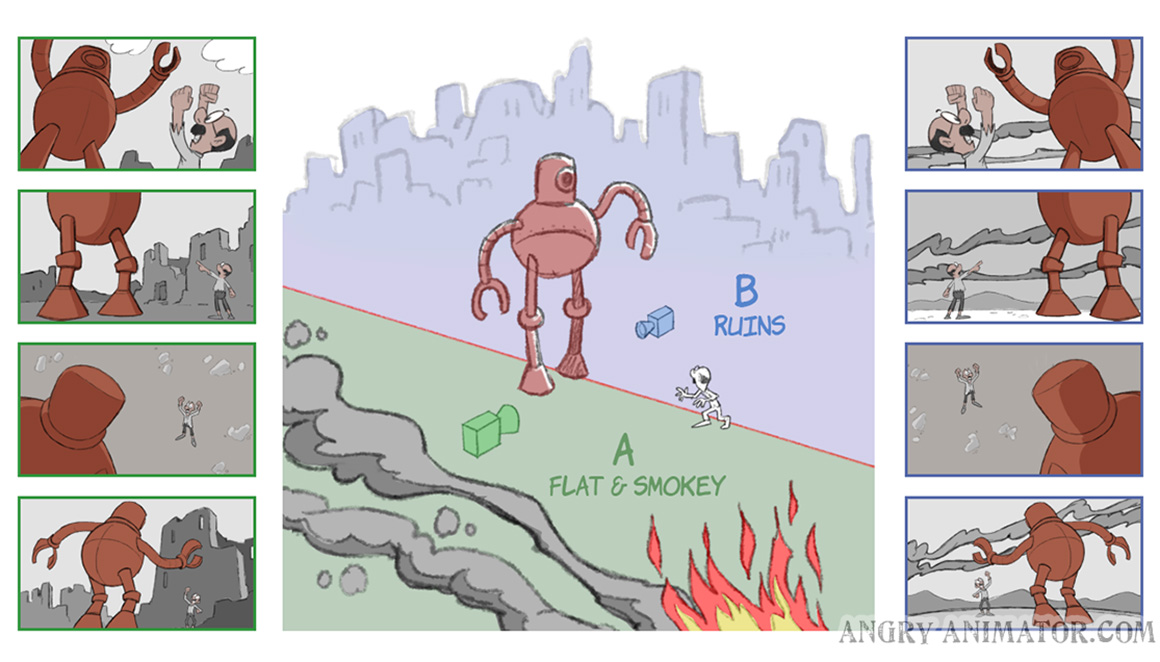
(Images from my Lynda / Linkedin course ‘Storyboarding’)

 A classic performance test is to draw a sack of flour or simple object in various emotions and actions. It should be possible to ‘read’ the pose without seeing a face or body parts:
 Animation acting has more in common with pantomime, or the physical comedy of the silent era. Buster Keaton, Harold Lloyd and Chaplin are great references. Strong poses are preferred to communicate emotions and inner states of characters.
(Images from my Lynda / Linkedin course ‘Drawing Cartoon Characters’)

 Keys are the main poses in a scene. In the head turn below there are two keys, in black.
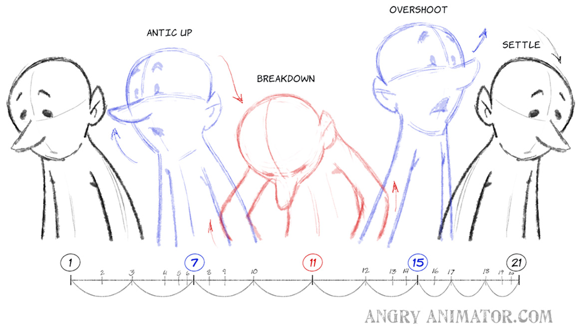 Breakdowns are the main drawings between the keys. By adding interesting actions to the breakdowns, your animation will be looser and more interesting.
(Images from my Lynda / Linkedin course ‘Breakdowns & Thumbnails’)

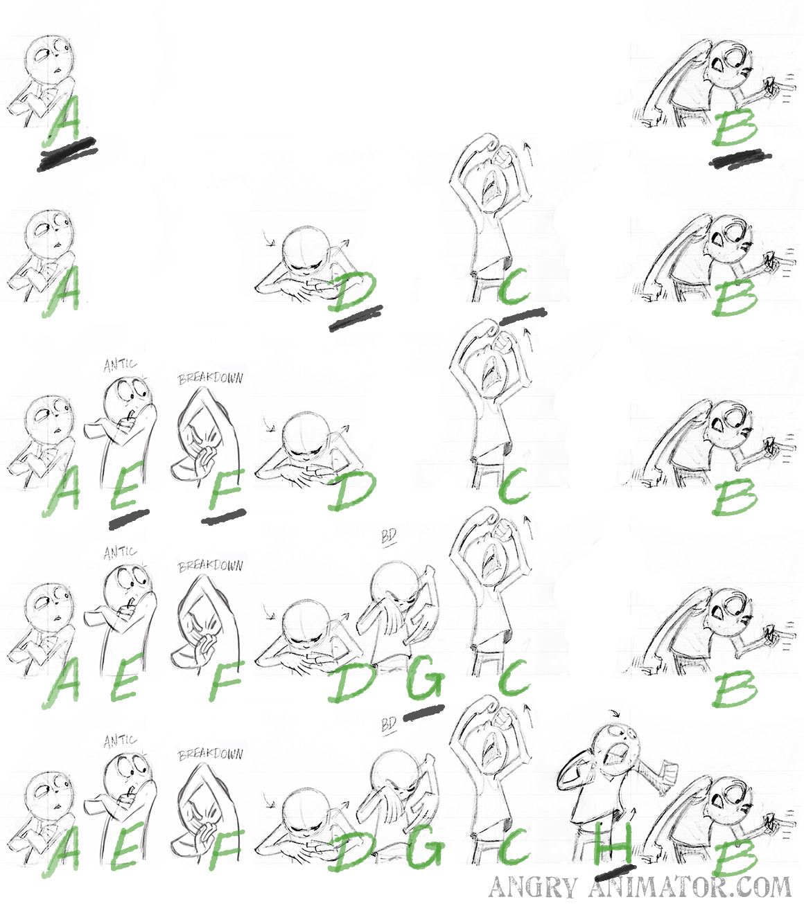
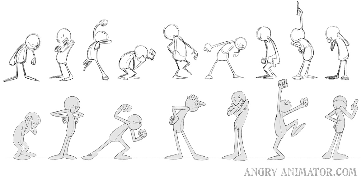
The two animation methods are ‘straight ahead‘ and ‘pose to pose‘. In straight ahead, the first key is drawn, then the second, then the third, and so on. The scene below was drawn straight ahead from left to right. I had no idea where I was going other than I wanted the character to be extremely upset.
 In Pose to Pose, the first key is drawn, then the last. The intermediate keys are then blocked in, followed by breakdowns.
(Images from my Lynda / Linkedin course ‘Breakdowns & Thumbnails’)
Straight ahead produces looser animation, but it is easier to lose control of the action. Pose to pose allows greater control, but can sometimes be a little stiffer than straight ahead.

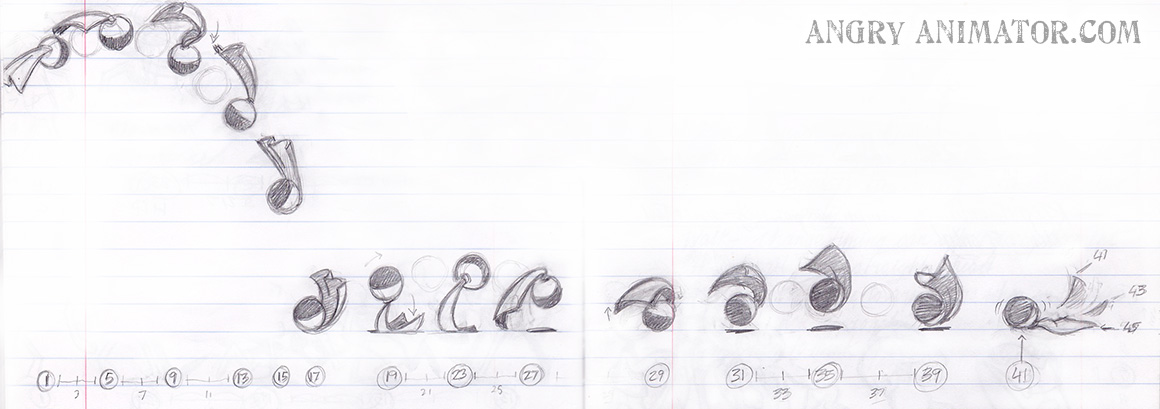
 Before animating, it is wise to sketch thumbnails. They can be stick figures or crude:
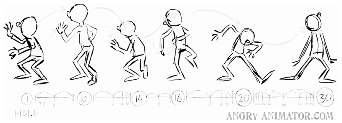 The more complex the action, the more important it is to thumbnail. I like to thumbnail on lined notepaper, as it’s easier to keep volumes consistent, or to work in depth.
Skipping the thumbnail process is a false economy. With a little effort, very complex actions can be planned as thumbs, allowing you to see the entire action in a single image. Thumbnailing combines the strenghts of straight ahead and pose to pose in one method.
(Images from my Lynda / Linkedin course ‘Breakdowns & Thumbnails’)

Timing is the frame number that the animator assigns to the key frames. Spacing refers to the position of the breakdown and inbetweens between those keys.
(Images from my Lynda / Linkedin course ‘Tips & Tricks’)
Two animations can have the same timing but totally different spacing, depending on how the animator spaces the inbetween frames.

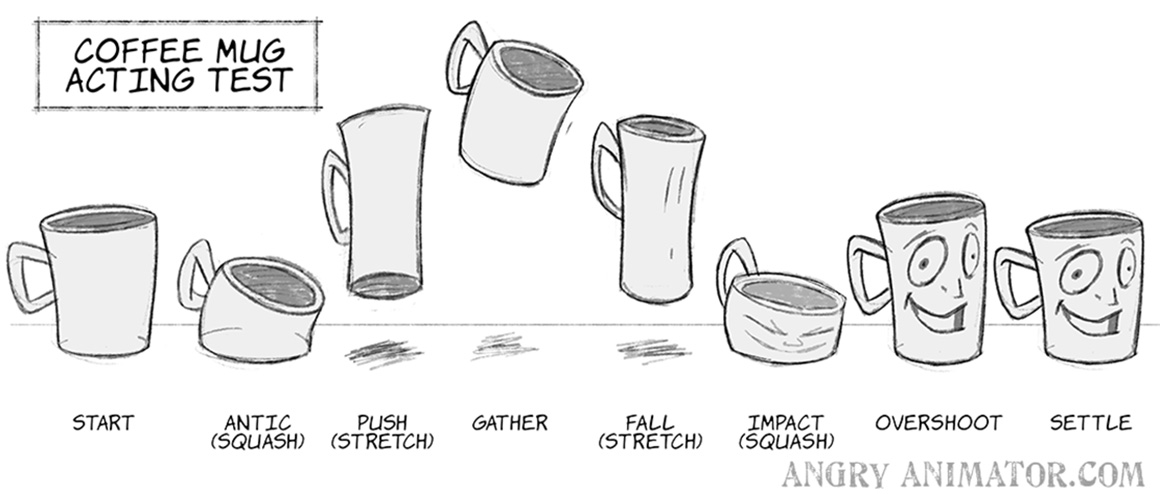
To create a natural or cartoony character, we squash and stretch them. The degree of squash and stretch can help determine how natural or cartoony the character is.
(Images from my Lynda / Linkedin course ‘Tips & Tricks’)
The more squash and stretch, the cartoonier. It’s important that volumes are maintained on the squash and stretch drawings, or the character will appear to grow in mass.

Most things move in arcs, or curved paths.
(Images from my Lynda / Linkedin course ‘Tips & Tricks’)

Most often the primary action is the body or character, with clothing or hair responding to the primary action.
(Images from my Lynda / Linkedin course ‘Animating Hair & Clothing’)

A character’s pose should be easy to interpret based on silhouette alone. No internal detail should be needed for the essential information of the scene to read. A good silhouette communicates the physical action and the emotion of the character.
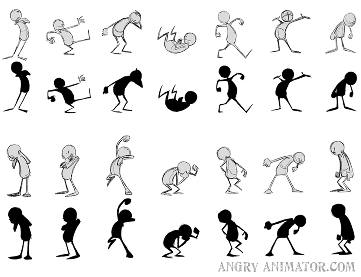
(Image from my Lynda / Linkedin course ‘Drawing Cartoon Characters’)

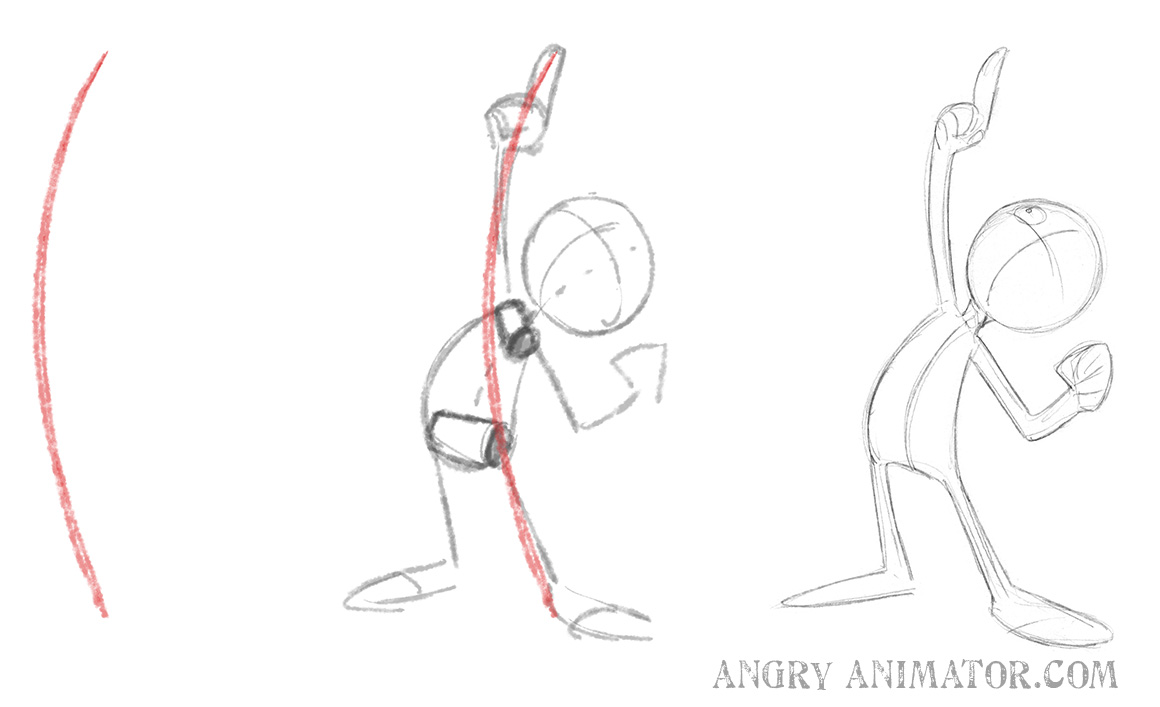
A line of action is an imaginary line that runs from the base of the character to their head, or along the strongest direction of physical action.
(Image from my Lynda / Linkedin course ‘Drawing Cartoon Characters’)
Build strong poses around a simple line of action – usually a C or an S curve. If a pose is built upon this basic form a stronger silhouette is easier to design.
(Image from my Lynda / Linkedin course ‘Drawing Cartoon Characters’)
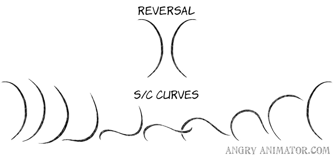
Applying this principle to animation, we find the power of reversals.
(Image from my Lynda / Linkedin course ‘Animating Hair & Clothing’)
Strong transitions occur when the line of action is reversed between keys. It gives characters flexibility. In the classic example above we see a whip or tail cycle from one C curve into an S curve, then into the reverse. The principle also applies to poses; below, a snap from one line of action into its reverse creates a sense of flexibility and/or power:
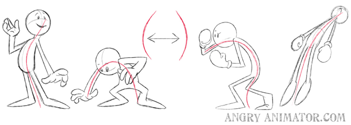
(Image from my Lynda / Linkedin course ‘Drawing Cartoon Characters’)

Before we move in one direction, it is common to antipate that action by moving in the opposite direction.
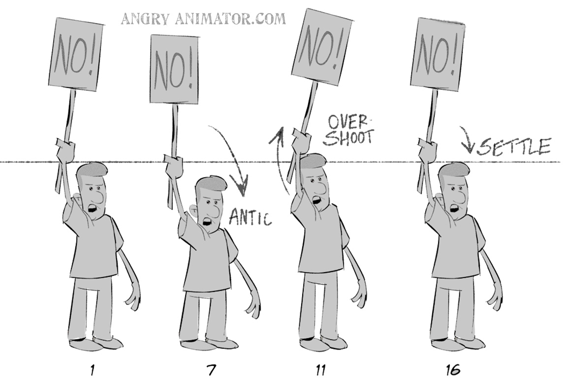
(Images from my Lynda / Linkedin course ‘Tips & Tricks’)


If a part of the body moves in one direction, there is usually a part of the body that moves in the opposite direction. This is a natural way for a character to remain in balance.
(Images from my Lynda / Linkedin course ‘Tips & Tricks’)


If a part of the body moves in one direction, there is usually a part of the body that moves in the opposite direction, twisting or ‘torqueing’ the body.
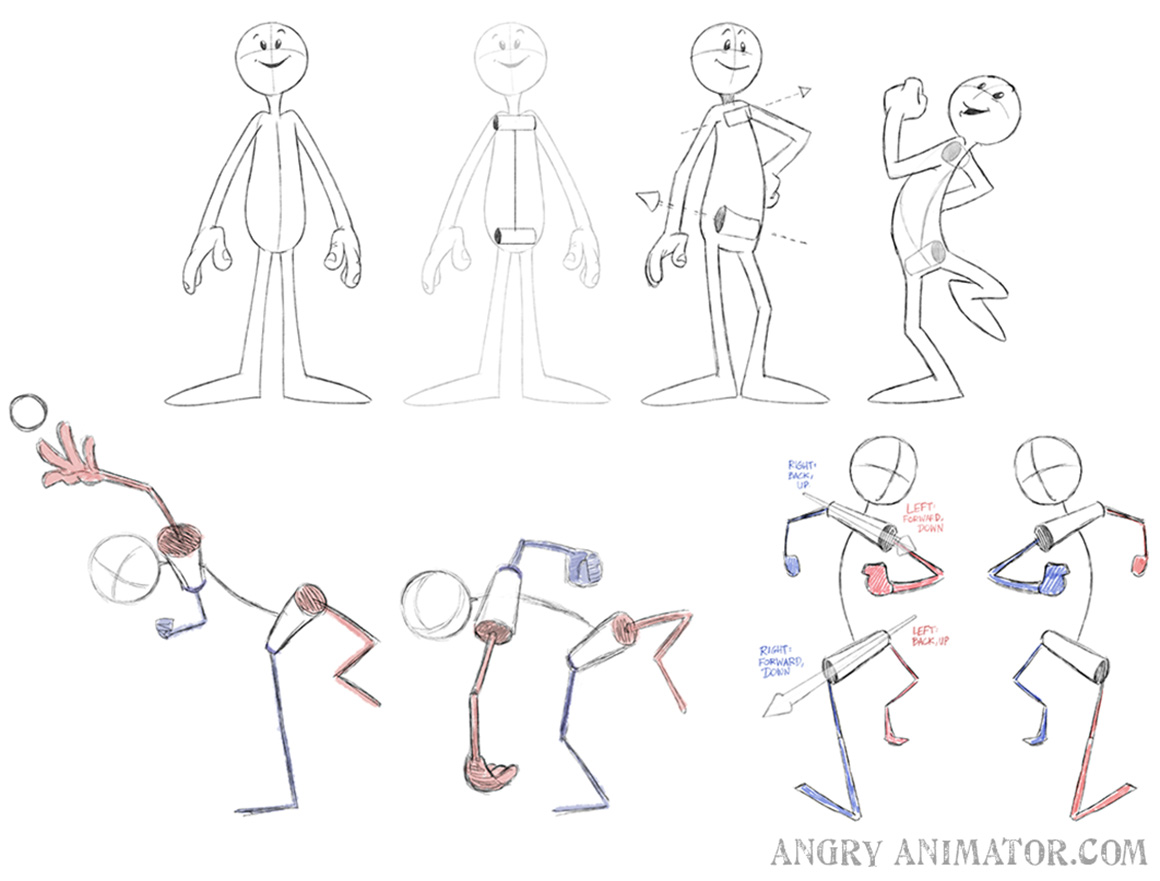 This is an opposing action but taken to another degree (or rotated). This technique was used by Renaissance artists to create lifelike and dynamic poses.
(Images from my Lynda / Linkedin course ‘Tips & Tricks’)

A given action can be led by a particular part of the body.
 The sections in red are the leading actions of this zombie walk.
(Images from my Lynda / Linkedin course ‘Animate Monsters & Aliens’)

This is a great technique for loosening an action and giving it that classic, loose limbed feeling. A broken joint is an extreme example of a leading action. In the case of the mummy below, we lead with the elbow so much that it seems to ‘snap’ for a moment on #25. It snaps back into its resting angle on #33.
The result is a sensation of looseness (but just for a moment, as the rest of the mummy walk is stiff and creepy):
(Images from my Lynda / Linkedin course ‘Animate Monsters & Aliens’)

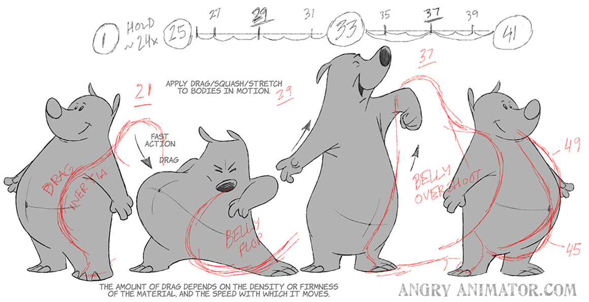
Different parts of the body move at different speeds. They can begin and end their actions at different times – their timing is said to ‘overlap’. Notice how the belly drags, moves behind the main character, and only settles into the final rest about eight frames after the main body.
(Images from my Lynda / Linkedin course ‘Tips & Tricks’)

Accents are the strongest points of motion in a scene: these are transitions that move at greater distance and/or speed. They’re most important in dialog scenes, where the voice rises and falls in pitch and emphasis.
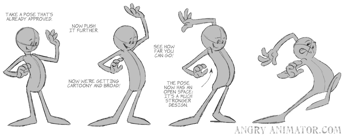
Exaggeration is left to last for a reason. Disney would often see a finished scene, something that worked perfectly well, and ask the animator to ‘plus’ it. In other words, is there anything you can do to squeeze a little more out of it. Obviously, this is something that you should really do BEFORE you animate your scene! However, it’s worth remembering that there’s always room for improvement, or for that little bit extra.
Any pose can be pushed further. How far can depend on the studio style. Some studios, for example, Warner Brothers, went to great extremes with the ‘Looney Tunes’ series. But push the pose or expression too far and it breaks!
Facial expressions can also be exaggerated!
(Images from my Lynda / Linkedin course ‘Drawing Cartoon Characters’)
The most extreme form of exaggeration is the world of ‘cartoon physics’, which reached its extreme in the ‘Looney Tunes’ series of the 1940s and 50s.
Animators do have to satisfy basic physical expectations. Characters should follow arcs, and have a center of mass. Eye catching glitches should be avoided. Note how the hammer spins around its center of mass:
(Images from my Lynda / Linkedin course ‘Tips & Tricks’)
That said, animators should NOT feel constrained by strict Newtonian ideas of motion. The beauty of the medium is that the everyday laws of physics can be applied in comic or magical ways, as in the character who doesn’t fall until he realises that he’s in mid-air.
Even in this case, the character must accelerate in a logical sequence (even if it is not realistic). So the feet fall first, speeding as they go, followed by the waist, then the chest, then the neck, then the head.
(Images from my Lynda / Linkedin course ‘Tips & Tricks’)
 Week by week I’ll write a post dedicated to each of the 21 Foundations, expanding on them and showing more examples.















I would love to purchase this illustration as a poster. Is this possible?
Thanks for this post.
Please how can I get the full tutorials?
Full tutorials here:
https://linkedin-learning.pxf.io/n63Bo